
Pink is a fun color, regardless of how we feel about whether or not it’s purely feminine. Recently, I had the chance to spend some time with the pink Blancpain Fifty Fathoms Automatique ref. 5007 12B44R NAFA. Here are some thoughts.
When I first encountered the new 38mm Blancpain Fifty Fathoms with the pink mother-of-pearl dial, I’ll admit I raised an eyebrow. Pink — historically coded as feminine, often relegated to the so-called “women’s watch” category — has never been a dominant color in the world of serious tool watches. And yet, in recent years, that unwritten rule has started to crumble.
We’ve seen pink chronographs, pink sports watches, and even pink-dial divers, all signaling a slight shift in how parts of the industry think about color. Still, a pink Fifty Fathoms felt like something altogether different. And the biggest surprise? It works. Right off the bat, though, I will say the price of this Fifty Fathoms is steep, at €18,400. It inhabits a segment above other iconic dive watches, including the Rolex Submariner.
A fun pink dive watch?
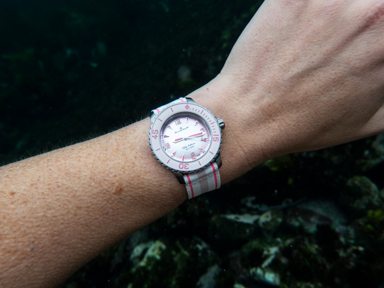
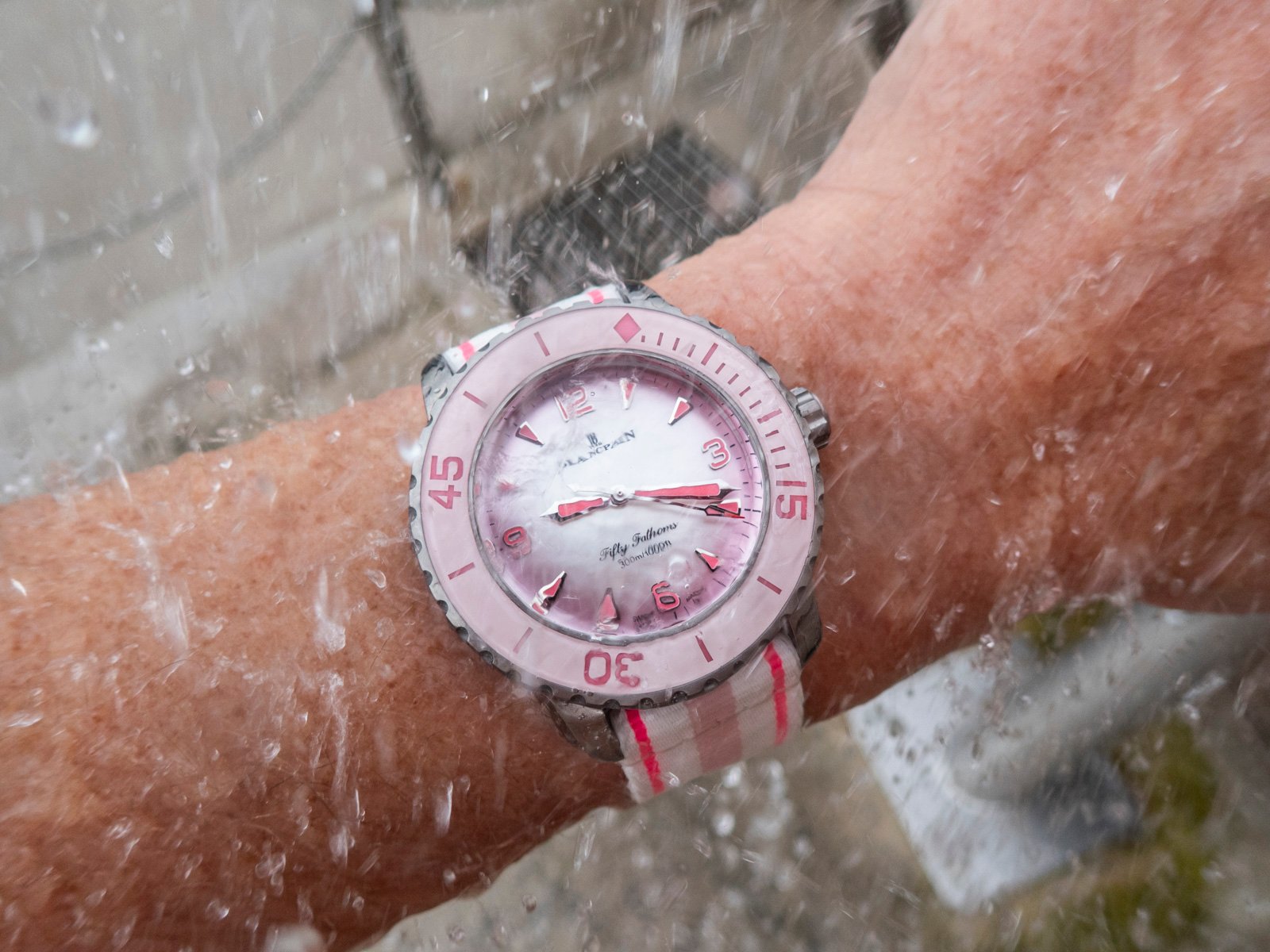
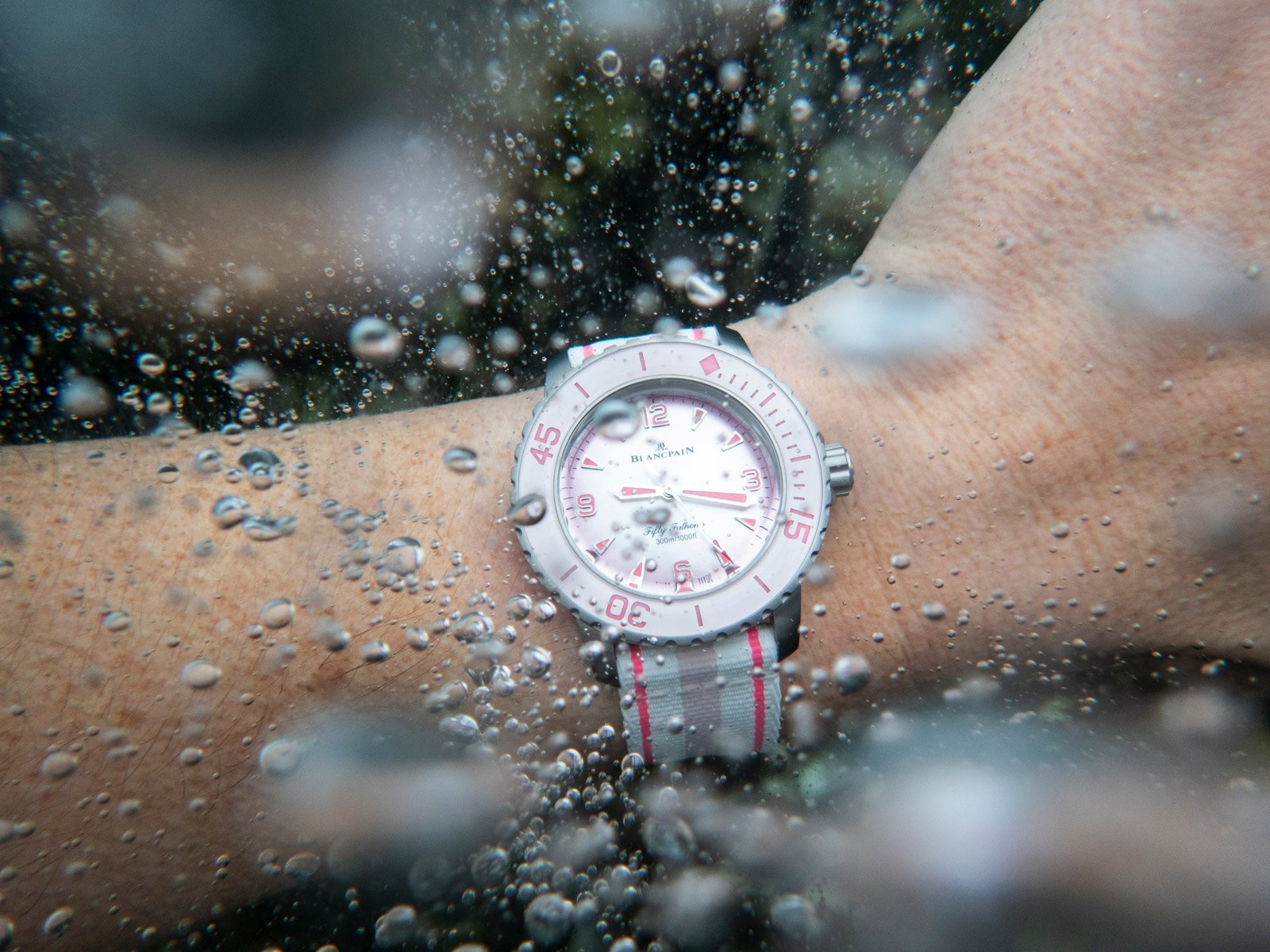
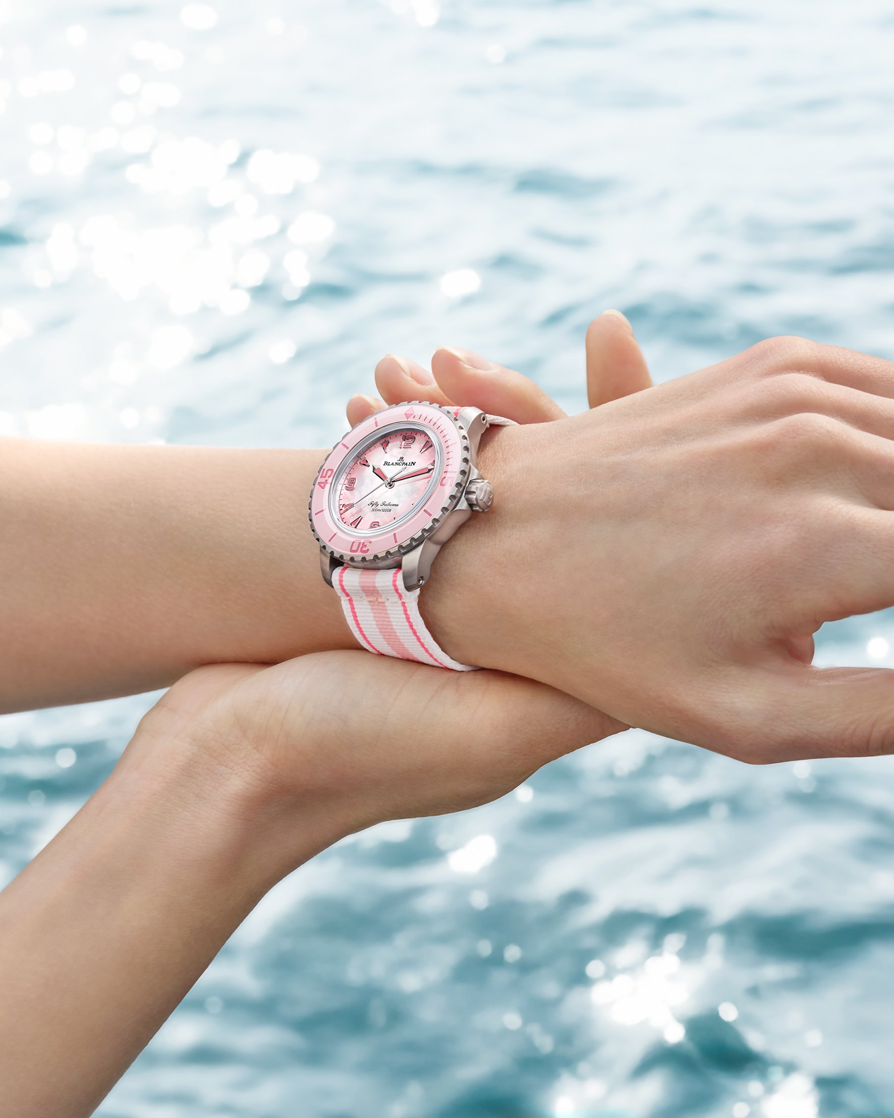
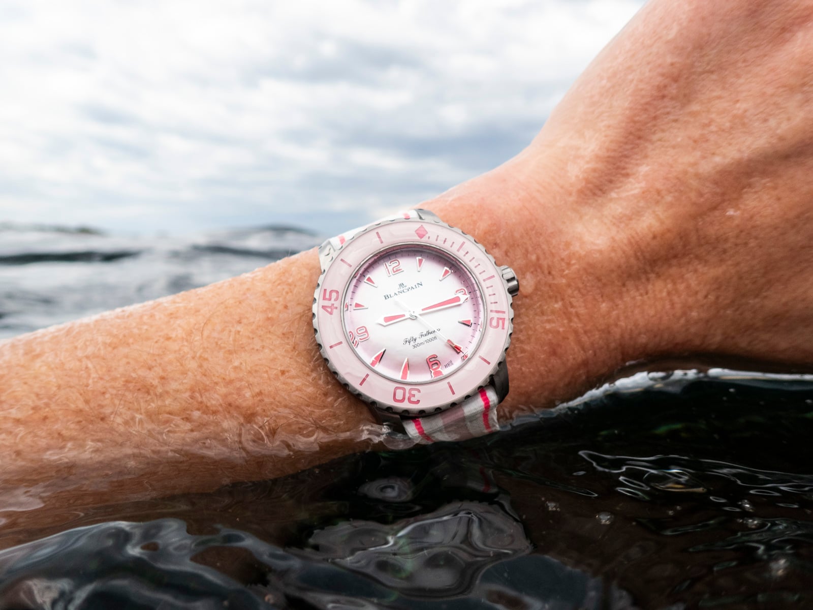
During a wear test in the Pacific, the pink dial proved not only enjoyable but also impressively functional. Pink, as it turns out, is more legible underwater than one might guess, particularly when paired with strong lume and a mother-of-pearl base that reflects ambient light beautifully. The Fifty Fathoms has always been a serious dive watch, and I expected the color to be the point of compromise. Instead, it became the watch’s personality. One thing I would say, though, is that to tone down the intensity of the experience, I’d change the strap to something a little more neutral.
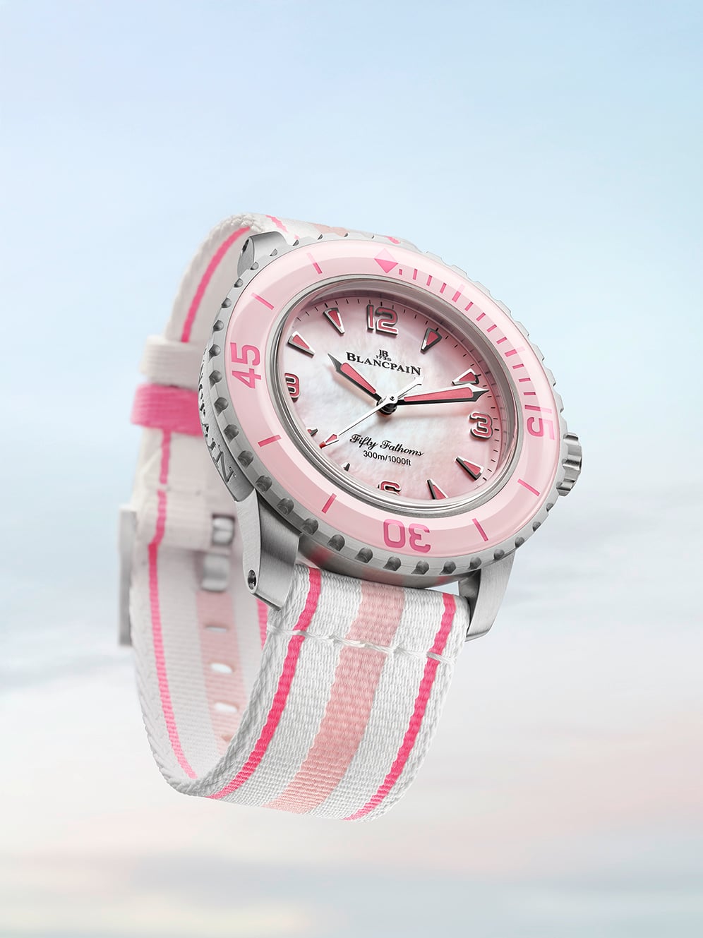
All the DNA of the Fifty Fathoms — unchanged despite the soft, shimmering surface treatment — is there. Everything underneath remains classic Fifty Fathoms. The 38.2mm case is titanium, a light, rugged, hypoallergenic, and corrosion-resistant metal. The proportions make the watch one of the most wearable modern divers Blancpain has released, especially for collectors who find the traditional 45mm models a touch imposing for daily use.
Strong specifications
The 12mm thickness is manageable, the 44mm lug-to-lug is friendly, and the unidirectional bezel keeps the iconic Fifty Fathoms style, bearing bold numerals, clear minute hashes, and the familiar domed look of the insert. The water resistance remains a bona fide 300 meters. There’s no softening of specifications here, no “fashion diver” dilution. This is the real deal.
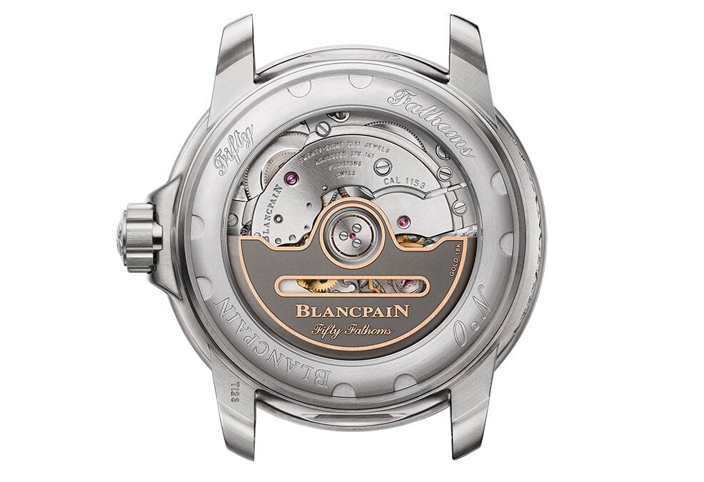
Powering it all is the Blancpain caliber 1153 — an in-house automatic movement with a generous 100-hour power reserve. It features a silicon balance spring for stability and resistance to magnetism, along with all the finishing one would expect from the brand. The transparent case back gives you a full view of the movement, grounding the watch firmly in modern luxury watchmaking while still honoring its utilitarian roots. In short, the pink dial does not make the Fifty Fathoms anything less than a Fifty Fathoms.
Are feminine dials “attractive”?
The star of this watch is undoubtedly the dial. The pink mother-of-pearl surface has remarkable depth, shifting from soft pastel hues to vivid iridescence depending on angle and light. It’s feminine in the most classical sense of the word — elegant, delicate, romantic — but also visually compelling in a way few dive watches dare to be.
Mother-of-pearl on a serious diver feels inherently subversive. We’re used to seeing matte blacks, military greens, perhaps a sunburst blue if a manufacturer is feeling adventurous. Here, Blancpain uses a material more at home in dress watchmaking, but instead of feeling out of place, it reinvents the aesthetic of a tool watch without compromising its utility. I’ll be honest: I expected the dial to feel at odds with the rugged reputation of the Fifty Fathoms. Yet, I came away feeling the opposite. The pink dial doesn’t soften the watch — it broadens it. It expands what a dive watch can look like without losing what a dive watch is.
Can men wear pink dive watches?
The short answer: of course, they can. The longer answer: they already are — and probably more comfortably than many traditionalists assume. During my time wearing it, I noticed that the titanium case plays a crucial balancing act. Its muted gray tone keeps the watch grounded and neutral, while the dial provides a burst of character. On the wrist, the watch never felt “costumey” or ostentatious; instead, it felt expressive, confident, and fun in a way that serious watches rarely allow themselves to be.
The notion that pink is “too much” for men is, to put it bluntly, outdated. We’re living in a time when men wear salmon dials with suits, pastel-tinted sports watches on weekends, and vibrant straps on everything from Seamasters to Speedmasters. Pink isn’t a boundary anymore — it’s an option. Yes, there will be environments where a pink diver will draw attention. But attention is not inherently negative. Watches are emotional objects, worn as much for personal satisfaction as for utility. If a watch brings joy, personality, or self-expression, then it’s doing exactly what it should.
The bigger question: should brands label watches as “women’s” based on color?
This watch raises a broader conversation that has been simmering for years: should brands still categorize watches by gender, especially when the only differentiator is color? I don’t think so. Dial color is not a functional distinction. It doesn’t dictate who can operate a bezel, who can appreciate movement finishing, or who can enjoy the tactile pleasure of a titanium case. And yet, the watch world still tends to treat pink, mother-of-pearl, diamonds, and smaller diameters as inherently feminine.
But what happens when a 38mm titanium dive watch with 300m depth rating — absolutely no compromise in mechanical or technical terms — is released with a pink dial? The old categories begin to blur. The Fifty Fathoms in pink is a true unisex watch, even if some of its visual cues suggest otherwise to conservative eyes. The sooner we shed rigid labels, the sooner more collectors will feel comfortable choosing what they genuinely enjoy rather than what they are “supposed” to enjoy.
Pink rising
The timing of this watch is no coincidence. Pink has been quietly rising in the watch industry for several years. Brands across the spectrum have released chronographs, divers, and field watches with pink dials that sell in global markets without any explicit gender positioning.
What we’re seeing is the democratization of color. The next generation of collectors — and increasingly the current one — wants playfulness, novelty, and individuality. Watches are not military tools anymore; they are personal artifacts. Color is one of the strongest forms of personal expression a watch can offer. In this context, a pink Fifty Fathoms feels less like an oddity and more like a signpost of where modern watch design is heading.
Closing thoughts
After some time with the watch — swimming, diving, photographing it in shifting light, wearing it casually and formally — I’ve come away convinced that this pink 38mm Fifty Fathoms is far more than a novelty release. It’s a beautiful, capable dive watch that challenges outdated assumptions about who can wear what and why. It reminds us that color has no gender. It proves that functionality and elegance can coexist. And it shows that even the most historic tool watches can evolve in unexpected ways without losing their essence.
Is it for everyone? No, but no watch is. Is it “too much” for men? Only for those still clinging to an old rule book that the rest of the industry has already begun rewriting. For everyone else, the pink Fifty Fathoms Automatique might just be the most refreshing dive watch of the year — one that dares to have fun, dares to be different, and dares to stay true to itself.